Personal Branding Guide
For my final project in my Design class this semester (Fall 2020), I was tasked with creating a brand for myself that included a logo, a palette, and typography. While I do have a logo already, I normally don't use it, because my brother made it for me a few years ago and it bothers me to showcase things that I didn't touch (also, I just can't give my brother that satisfaction). Below is that original logo, as well as early-stage sketches for this project.
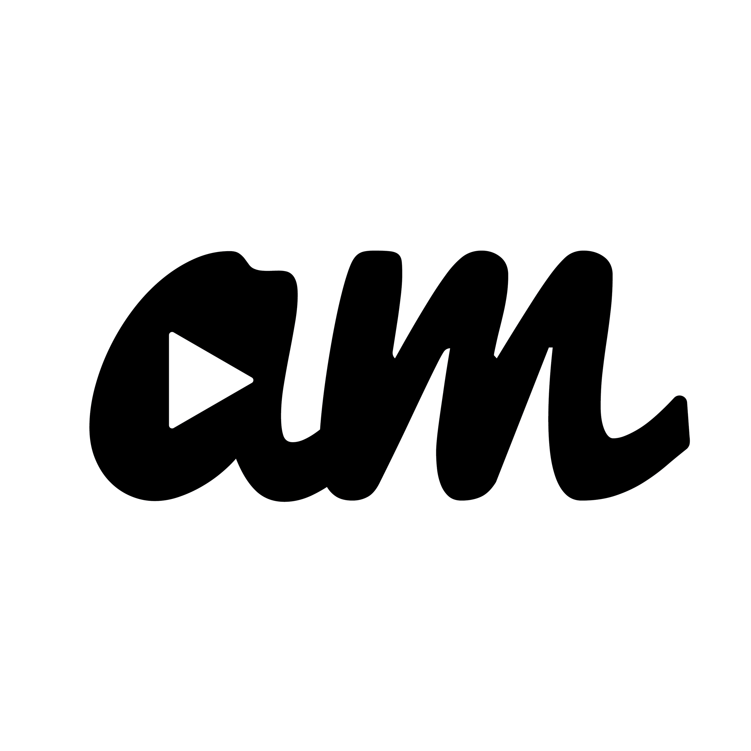
Original Aidan Massie Logo
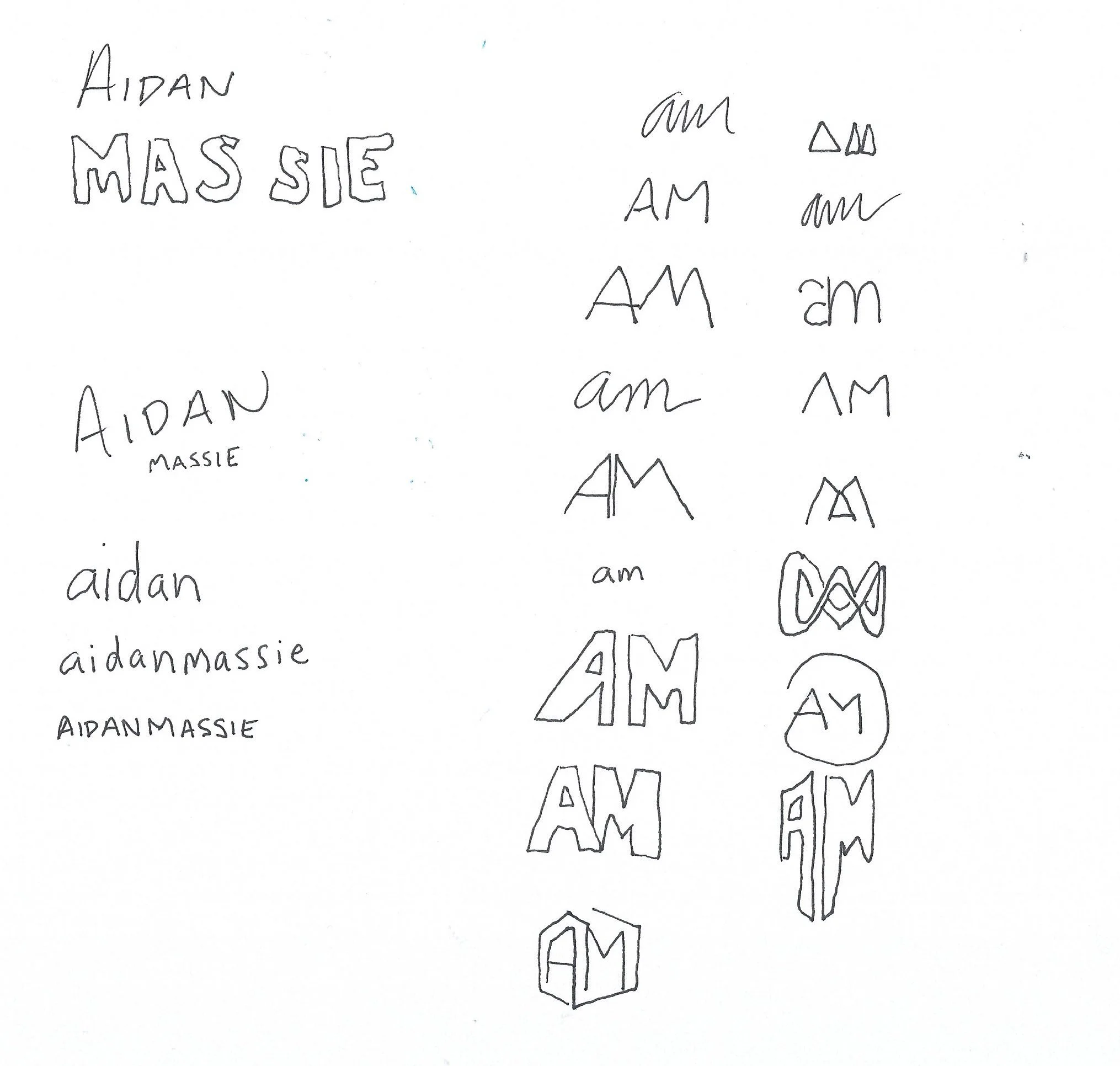
Sketches for New Logo
I was, and still am, pretty big into making videos and such, and a play button seemed like an ideal fit for the old logo. When trying to think about what to include in this logo, I struggled. I feel like I've expanded my wheelhouse, making me be able to do a lot of things, but not be perfect at one specific thing. So, in order to represent myself, I thought of an infinity symbol. As Wikipedia defines it, infinity "represents something that is boundless or endless, or else something that is larger than any real or natural number." As a human, I technically can't be larger than any real or natural number, but the idea of being boundless or endless struck me. As mentioned before, I can do a lot of things, and I love to learn a lot of things, but I'm not perfect at any of them. I felt like the infinity suited my skillset, because I am always eager to learn how to learn new things, adding to my arsenal of an already large list. So, I managed to create an infinity symbol that includes my initials, AM.
I've found in my design work that I prefer a more minimalist look, and that definitely carried into this project. I went with a minimalist color palette that is strictly black and white. At first, I attempted to throw some colors on the logo, but the black and white proved to be more simple, elegant, and sharp. In terms of font choice, the logo is actually a custom typeface, created by the beautiful pen tool in Illustrator. For the sake of the guide, I have decided that the logo has to be paired with Proxima Nova, the font family that is used across my website, resume, etc.

Font and Color Choices
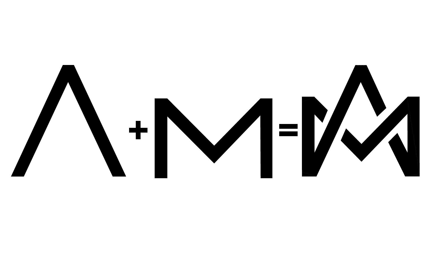
Combination of the A and M
With the idea of my initials, AM, in mind, as well as the idea of my endless passion for knowing how to do a lot of things, check out the final iteration of logo below!

Final Concept of Aidan Massie Logo
I went ahead and created some examples for the logo in use. Below you're able to see an example of the logo in the middle of the nav bar on my website, as well as some mock business cards--not my real number, so don't come calling.

Mock Website Header

Business Card Mockup
Overall, I had a really great time working on this. It's about time I made a logo for myself and quit giving my brother the satisfaction. Let me know what you think!